Discipline
Brand Identity
CD & AD
Matej Ferlič
Design
Matej Ferlič
Visualising a philosophy of movement
Kuga 1518
Kuga1518 is a hip hop freestyle dance crew formed by talented individuals with years of shared experience in dance and movement. Kuga Studio is the space they created to pass that knowledge, experience, and approach on to others. The identity needed to represent both sides of Kuga without diluting either. Kuga1518 required something exclusive and unmistakable that the crew could identify with and carry as its signature. Kuga Studio needed to open that same world to others through a professional education platform. The challenge was to build one visual universe that could hold two distinct roles while making their relationship immediately clear.
For Kuga, dance goes beyond technique and movement. It is connected to discipline, exploration, spirituality, personal growth, and a constant search for individual expression. Rather than looking at the conventional visual language of dance studios, we looked directly at the culture surrounding that philosophy. Hip hop and underground music meet mystery, spirituality, darkness, and raw expression. These influences were already part of Kuga’s world, so our role was not to invent a character for them, but to capture and systemise the one that already existed. That became the foundation for an identity that could feel honest to the crew while remaining flexible enough to support Kuga Studio as it grows into a wider education platform.
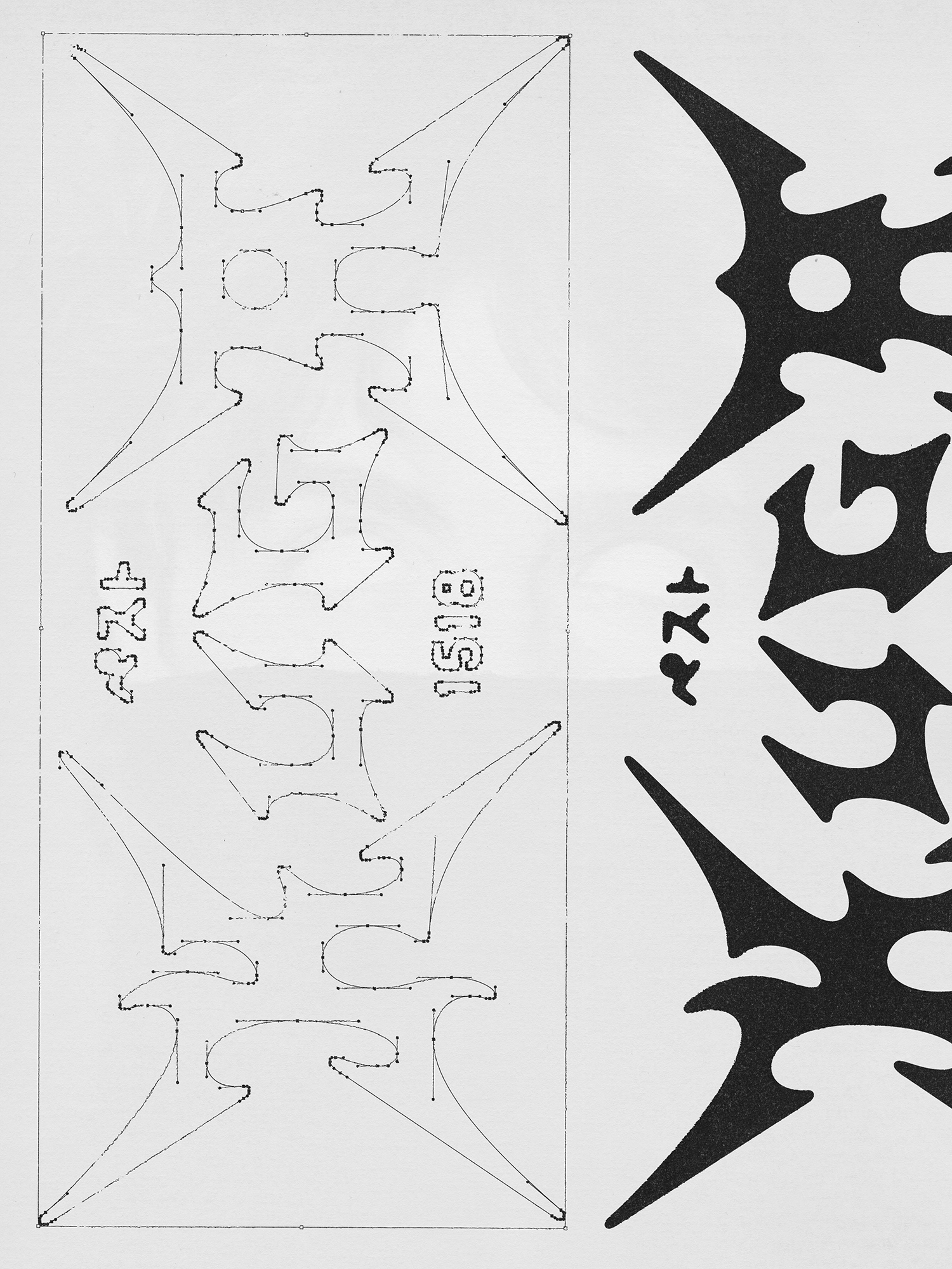
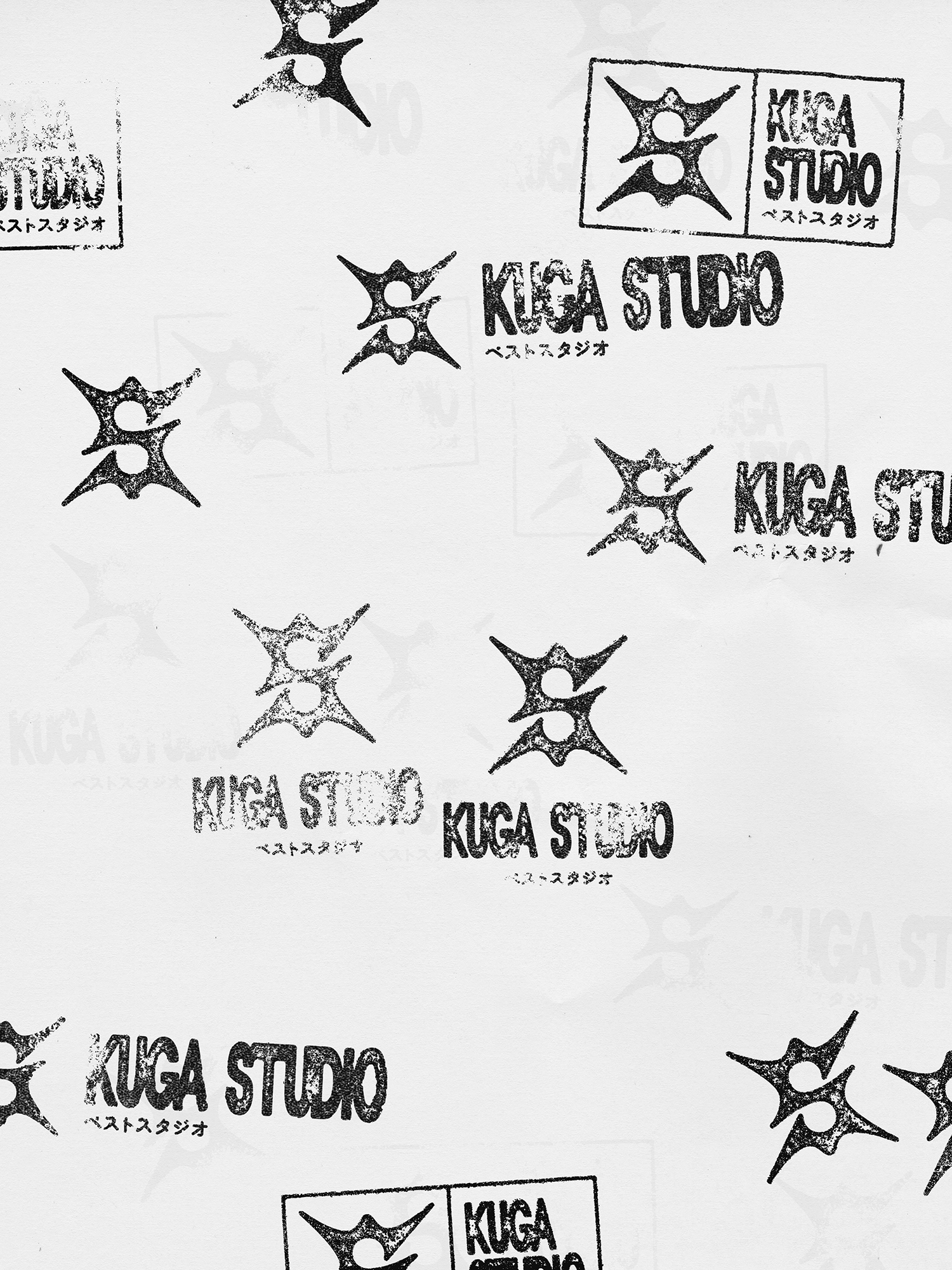
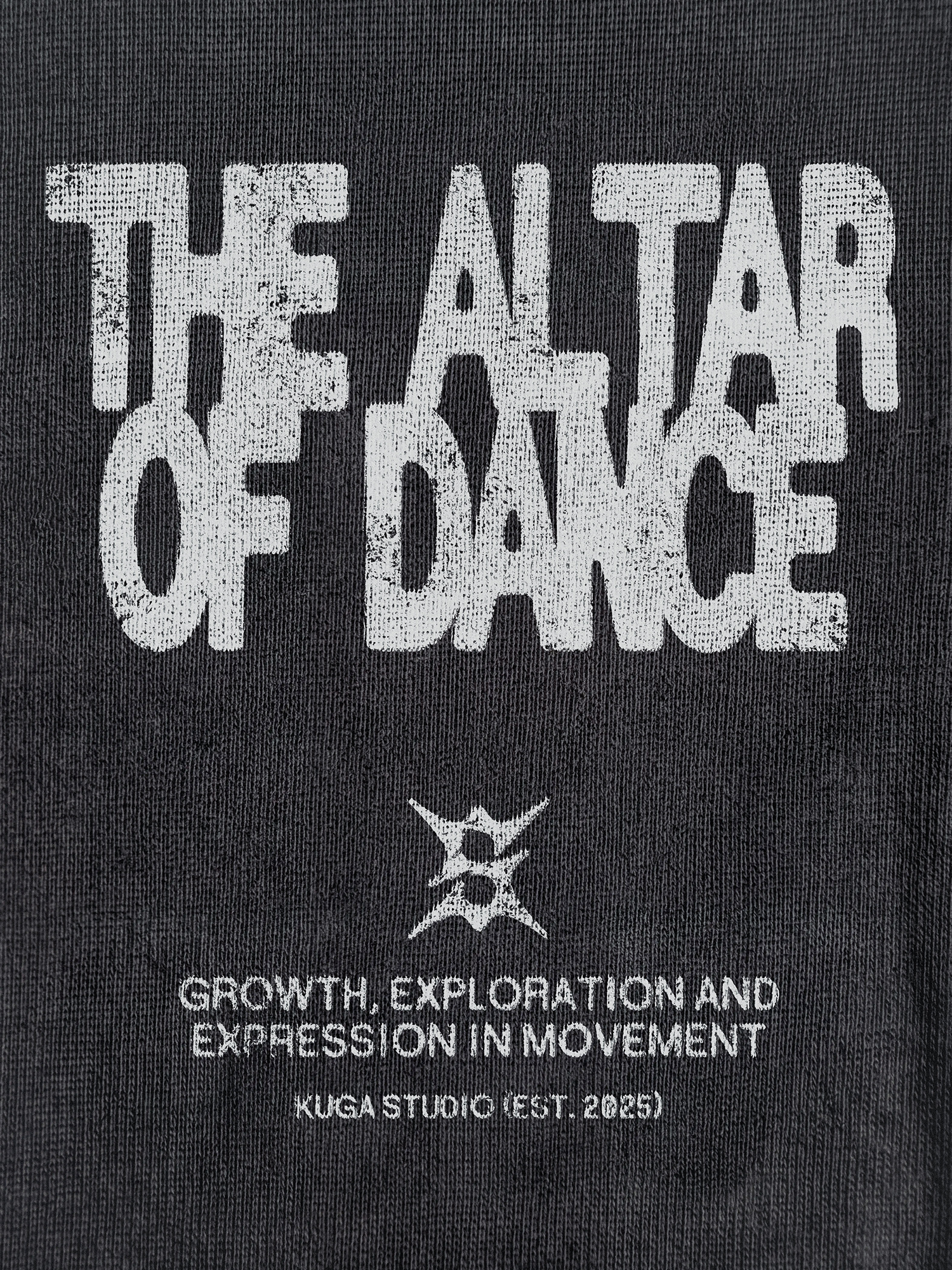
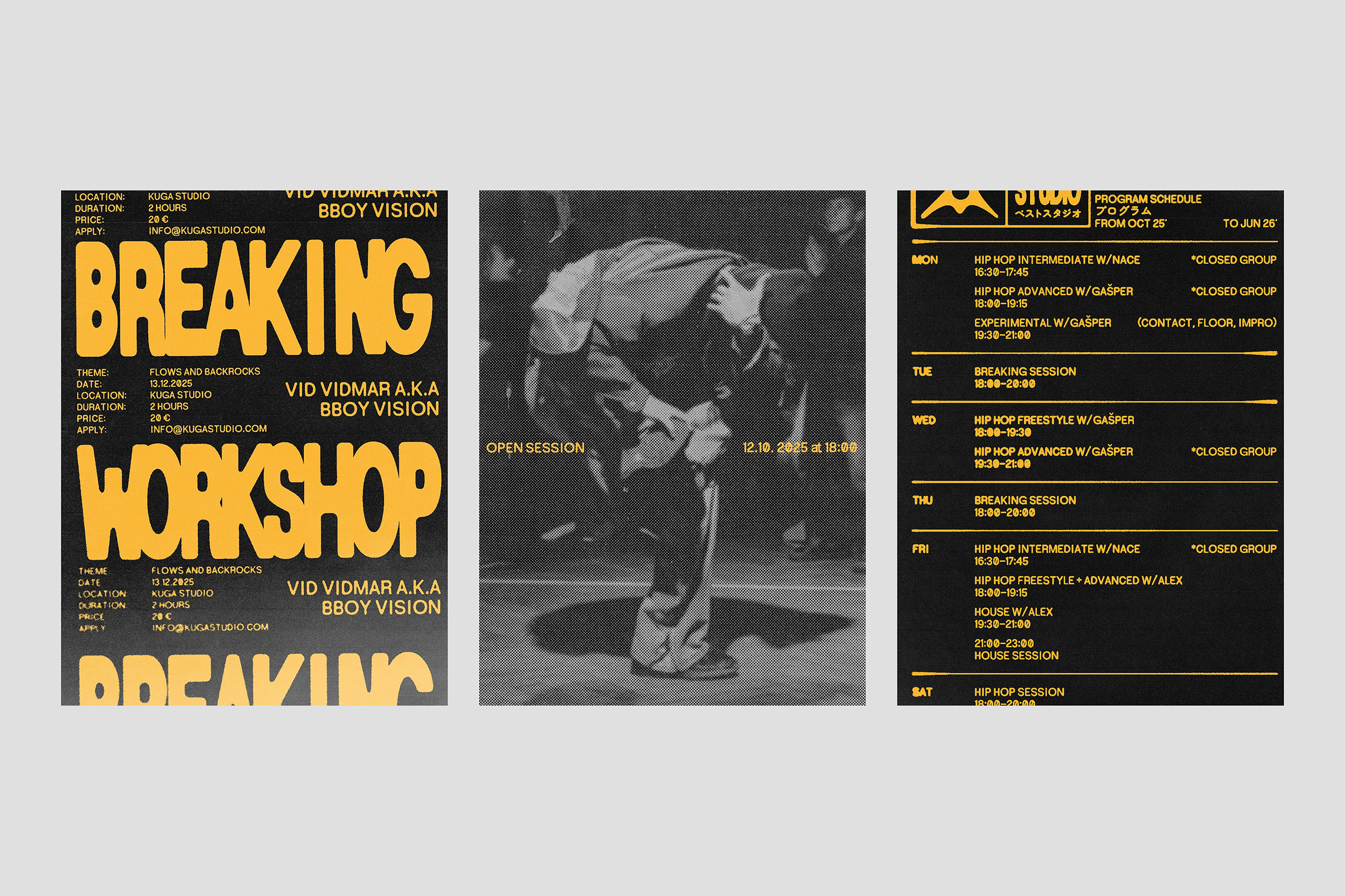
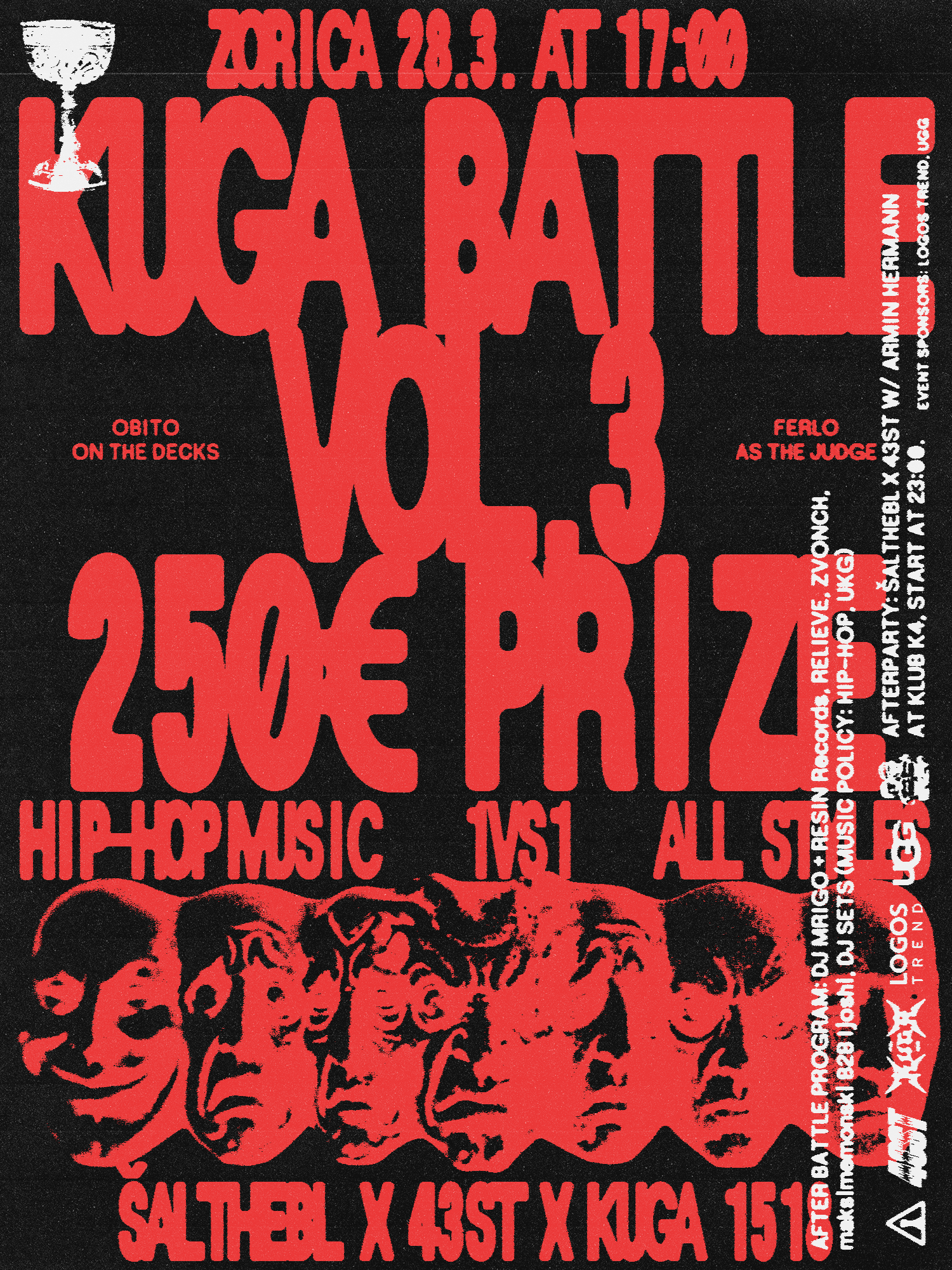
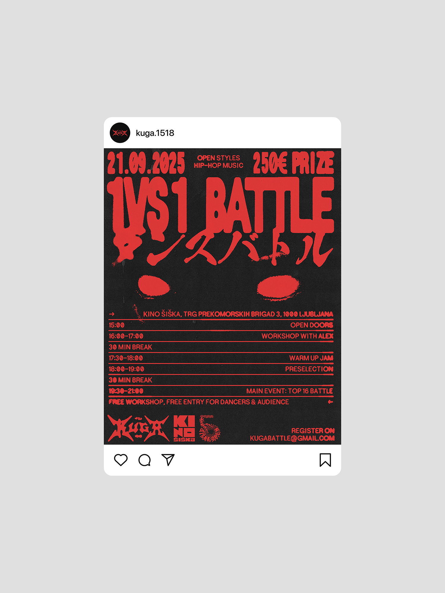
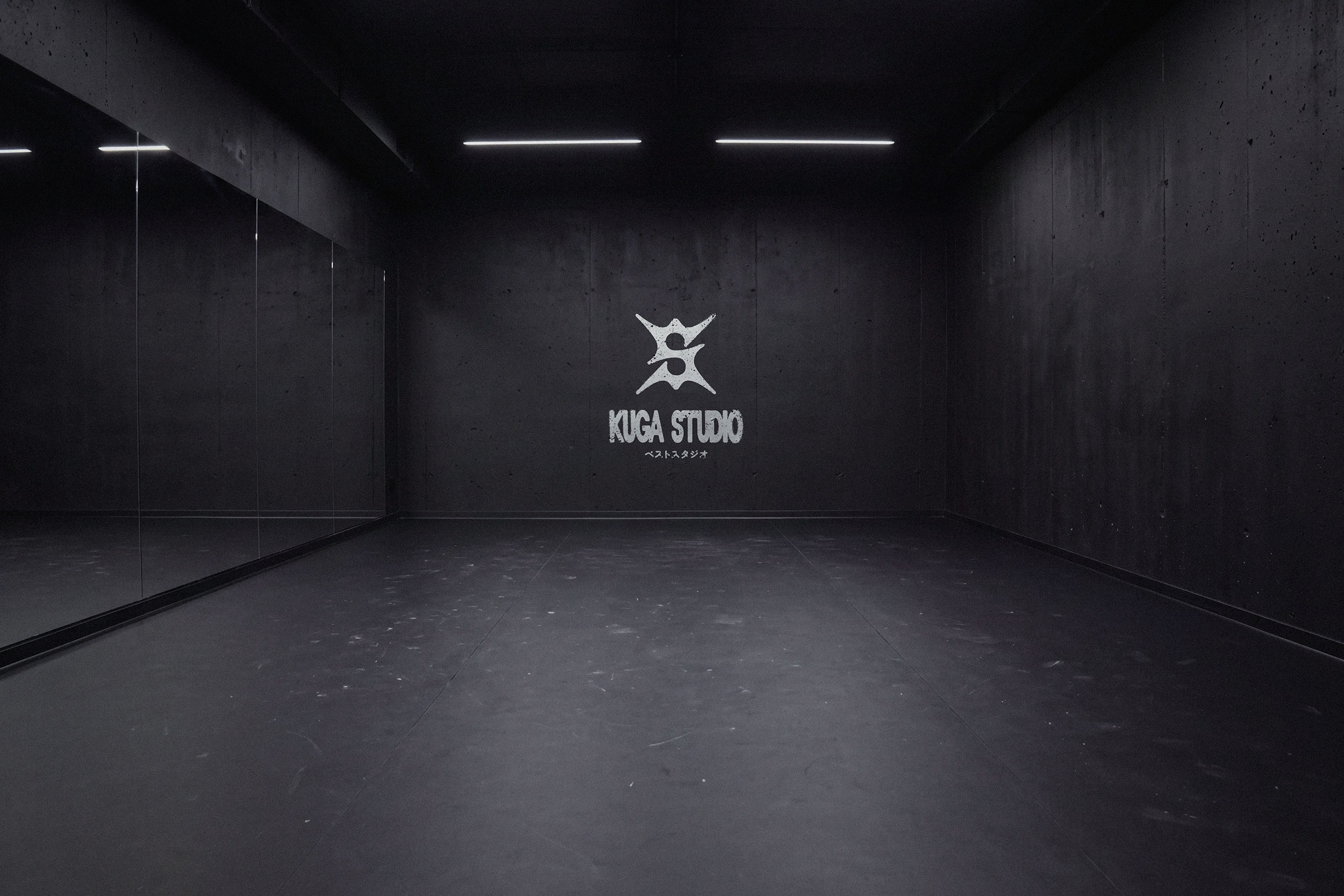
We translated Kuga’s world into a bold visual system built around blurred typography and symbols, powerful compositions, occult inspired illustrations, raw textures, and a predominantly dark visual environment. Together, these elements create an identity that feels underground, mysterious, expressive, and immediately recognisable. Within that shared language, each side of Kuga receives its own expression. The Kuga1518 logotype combines influences from heavy metal lettering, street culture, and blurred graphics into a distinctive wordmark that acts as the crew’s signature. Kuga Studio uses a separate symbol drawn from the same visual DNA, forming an abstract S while suggesting a dancer suspended in movement. Colour creates the clearest distinction between the two. Occult Red belongs to Kuga1518 across merch, performances, events, and crew communication, while Dojo Yellow identifies Kuga Studio across workshops, schedules, pricing, and educational materials.The result is one coherent visual universe that both brands can wear in their own way. Kuga1518 remains exclusive and unmistakable, while Kuga Studio opens the same culture to others without compromising the character it came from.
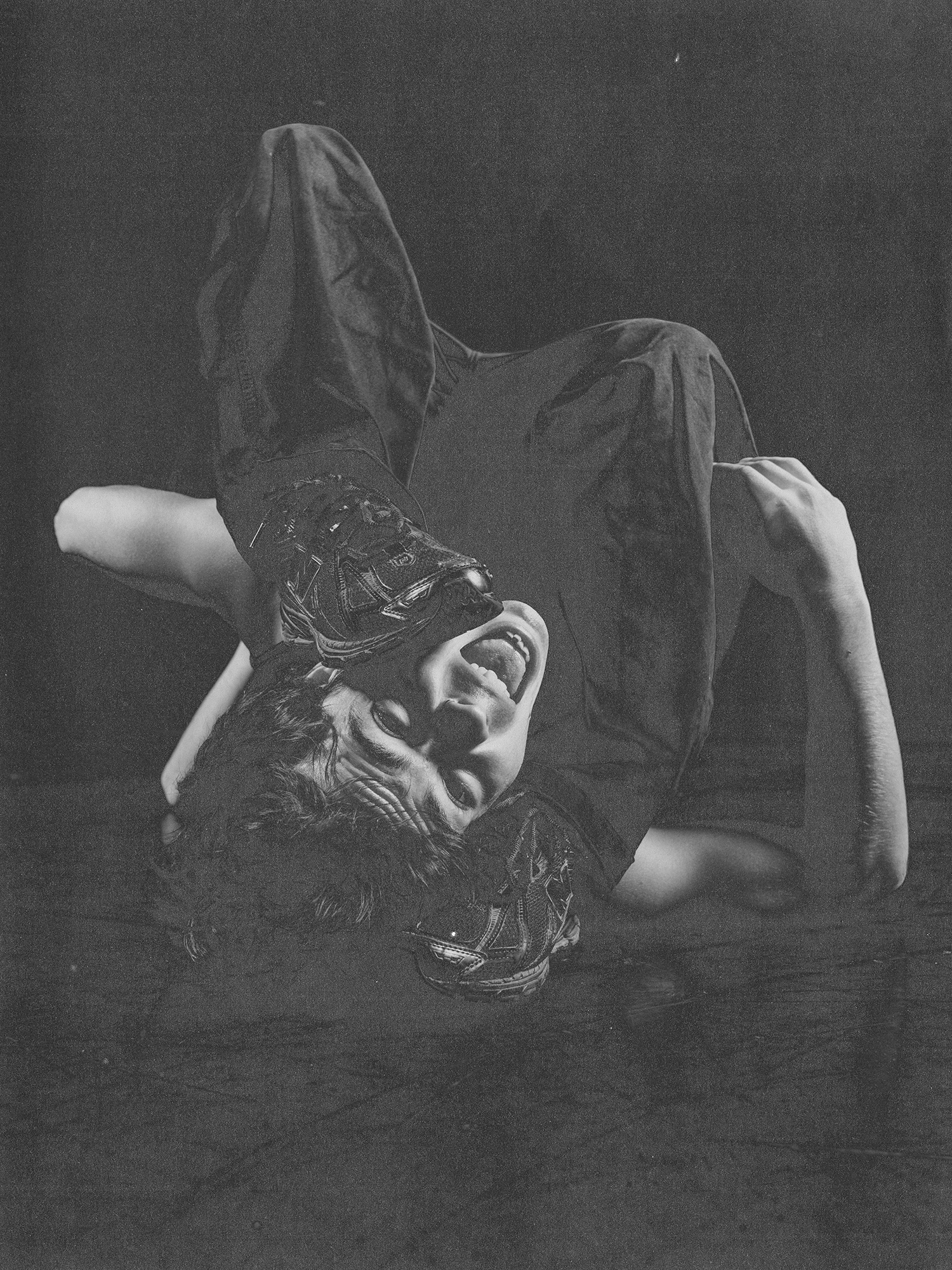



Cinematography: Bruno Papić, Photo of the dancer: Rok Valenčič